


Creating the Thumbnail for 'Beginning the Journey'
Sharing the process behind my first post's thumbnail design.

Substack Thumbnail Process for ‘Beginning the Journey’
I wanted to take some time to share my design process for the thumbnail of my first Substack post. My approach might not be as elaborate or detailed as some, but I’ve always valued simplicity and minimalism in design. For me, the goal is to create something clean and consistent while still leaving room for growth as I refine my style.
I’m still working toward a cohesive theme for my thumbnails, and I hope to establish a consistent design over time. While I haven’t showcased my full branding process yet, I’d love to share it in the future when it’s more developed.
For this first blog post, I aimed for a welcoming and friendly vibe. I included a mascot character in the design—someone I hope brings joy to others. I haven’t come up with a name for them yet, but I think they’ll be a fun addition to my posts.
Getting Started: Ideal Image Size for Substack
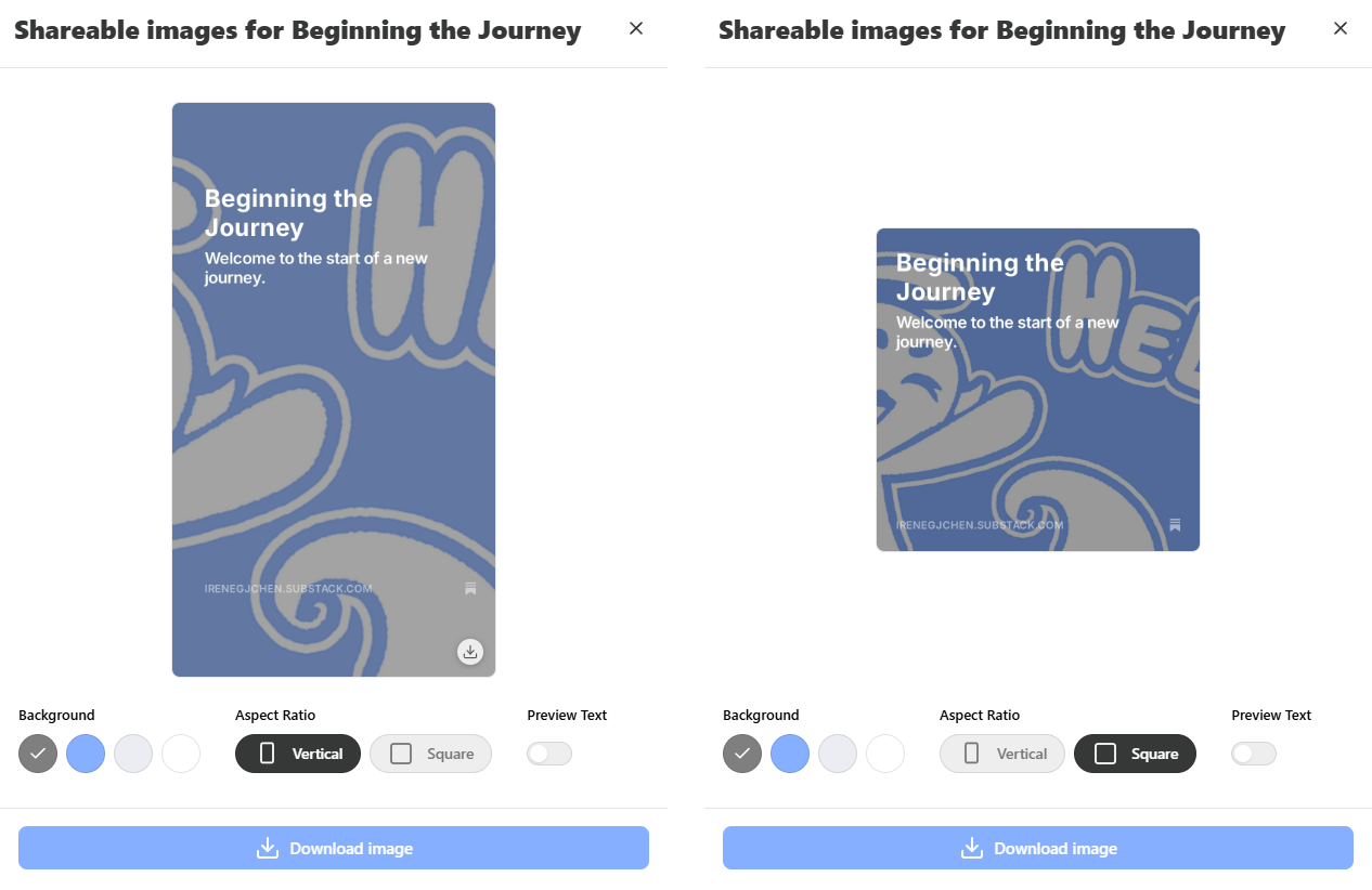
When designing for any platform, it’s always good to check the recommended image dimensions. For Substack, the ideal thumbnail size is 1200 x 630 pixels. It’s a bit different from the usual sizes you might see on other platforms, but I assume it’s optimized for sharing posts and attracting new readers.
The Thumbnail Sketch
For this thumbnail, I started with a simple sketch. Unlike more complex design processes with several iterations, I opted for something quick and straightforward to accommodate how often I plan to post. Sometimes, the first idea is the best one, and it’s okay to circle back to the initial concept after exploring other possibilities.


Iteration and Adjustments
The first version of the thumbnail seemed promising, but I noticed issues when previewing how it would look on social platforms. The image was off-center, and the text placement wasn’t ideal. Substack prefers centered designs, and having text cut off in sharable previews can make the image feel cluttered or messy.
To address this, I reworked the layout to center the main elements and made sure the design would look clean and balanced across different platforms.

Final Design and Happy Accidents
For the background, I experimented with different ideas like clouds and splash patterns. Unfortunately, those designs didn’t work as well as I’d hoped—they either felt too dark or too busy. Eventually, I stumbled upon a simple design with alternating colors radiating out from the mascot. This helped draw attention to the center and kept the overall look clean.
While I initially wanted a splash theme, it was tricky to achieve digitally with a mouse. In the end, this simpler background became a happy accident, and I’m proud of how it turned out.


Looking Ahead
With this thumbnail, I wanted to show not just my marketing experience but also my creative side, including my love for drawing. I hope to keep each thumbnail unique while showcasing my growth as a designer.
Thanks for reading! I’m excited to continue sharing my journey and designs with you all.
View Original Blog Post
